Using the Metrics Plot Frontend
The Metrics plot frontend is able to generate a line or bar chart of most TKO database fields against aggregated values of most other TKO database fields. This is usually used to create plots of performance data versus some machine property, such as kernel version or BIOS revision.
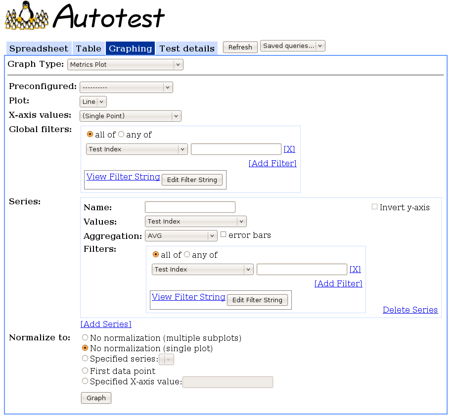
Using the Interface
Interface Options
- Graph Type: Set to “Metrics Plot” to show this interface.
- Preconfigured: Select a preconfigured graphing query. Use this to automatically populate the fields in the interface to a preconfigured example. You may then submit the query for plotting as is, or edit the fields to modify the query. See Graphing Pre Configs to more information about preconfigured queries.
- Plot: Select whether you want a line plot or a bar chart.
- X-axis values: Select the values to place across the x-axis of the plot. For example, selecting “Kernel” create a plot against different kernel versions across the x-axis. See GraphingDatabaseFields for details about the different options. In addition to the options listed there, X-axis values also accepts “(Single Point)” as an input, which will plot all values on a single point on the x-axis; this is more applicable for bar charts than for line plots.
- Global filters: Set the filters to apply across all series of the plot. See GraphingFilters for more information on setting a filter.
- Series: Set each series that you would like to display. Clicking
the [Add Series] link adds a series to the list. Each series has its
own Delete Series link, which will remove the series from the list.
If there is only one series and it is deleted, it will instead be
reset.
- Name: The name you want to give the series. It will be displayed as the title of its respective subplot if you requested multiple subplots, or as a label in the legend otherwise.
- Values: The values you want to aggregate to plot on the y-axis. Typically, this is “Performance Keyval (Value)” to aggregate performance data.
- Aggregation: The type of aggregation you want to do on the data returned for each x-axis point. For example, specifying “AVG” will plot the average of the value you selected above for each point on the x axis.
- error bars: If the Aggregation is “AVG”, you may check this box to show the standard deviations of each point as error bars.
- Filters: Set the filters you want to apply to this particular series. See GraphingFilters for more information on setting a filter.
- Invert y-axis: Check this box if you want higher numbers towards the bottom of the y-axis for this series.
- Normalize to: Set the normalization you want to use on this plot.
- No normalization (multiple subplots): Do not normalize the data, and display each series on a separate subplot. Note that this option is only available for Line plots.
- No normalization (single plot): Do not normalize the data, and display all series on a single plot. This is the default option.
- Specified series: Graph all series as percent changes from a particular series. That is, for each point on each series, plot the percent different of the y-value from the y-value of the specified series at their corresponding x-value. The series that you normalize against will not be plotted (since all values will be 0). If the series you normalize against does not have data for some x-values, those values will not be plotted.
- First data point: Graph all series, renormalized to the first valid data point in each series.
- Specified X-axis value: Graph all series, renormalized to the data point at the specified x-axis value for each series. This is similar to the above option, but rescales the y-axis for a point other than the first data point. You must enter the exact name of the x-axis value.
Interacting with the Graph
The four main actions you can do on the graph are:
- Hover: Hovering the cursor over a point or bar shows a tooltip displaying the series that the point or bar is from, and the x- and y-values for that data.
- Click: Clicking on a point or bar opens a drill-down dialog. The dialog shows a sorted list of all the y-values that were aggregated to form the point or bar. Clicking on any particular line in that list jumps to the Test detail view describing the test that generated that line of data.
- Embed: Clicking the [Link to this Graph] link at the bottom-right of the generated plot displays an HTML snippet you can paste into a webpage to embed the graph. The embedded graph updates with live data at a specified refresh rate (as the max_age URL parameter, which is in minutes), and show an indication of the last time it was updated. Clicking on the embedded graph links to the Metrics plot frontend, automatically populated with the query that will generate the graph. See AutotestReportingApi for a more powerful way to embed graphs in your pages.
- Save: The graph is delivered as a PNG image, so you can simply right-click it and save it if you want a snapshot of the graph at a certain point in time.